

Snowy Owl WIP
Nov. 28th, 2021 01:02 am
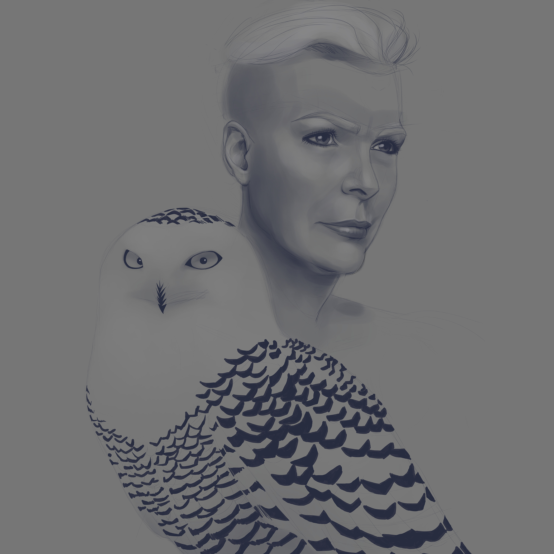
Yup, this is still an ongoing thing, lol.
Yes, I haven't corrected the fur shading, or added highlights on the woman, or even cleaned up the crown, but here I am moving forward with the bird.
Painting this has been chaotic from the beginning. I wanted to abandon this, but I've determined to finish this no matter what, even if it takes me a gazillion years.

Yup, Still Working On This
Nov. 8th, 2021 06:14 pm
I need to destressify so I'm determined to finish this. I changed the woman's fur and crown from white/gold to black. It helps the mostly white bird stand out more. I'm also removing the vest on the bird. Tbh, it doesn't need it.

In the Works
Aug. 27th, 2021 11:44 pm
I want to try something different for my first Creative Market product. So, I've decided to make a series of minimalistic vector hummingbirds. I usually do the naturalistic thing, but for the sake of time and doing something different, geometric birds are the way to go.
I haven't decided if I want to add textures or leave as is. The look and feel is basically finished, I just need to adjust a few things. I can't wait to create the other five or so cute birds.

ART DUMP!!
Jul. 29th, 2021 12:02 am
Memories. I found this infographic I created for my first attempt at freelancing. The image was suppose to explain to potential clients what to expect during the design process.
I had so much time back then. I creating all individual assets from scratch, yes even the credit card, lol. Illustrator has it's charms.

LOL
Yes, I'm still working on this.
I used Illustrator to clean up the crown. Once I finish the face/neck I will blend the crown better into the skin. I gotta clean up the bird by blending the front feathers better. Still need to add buckles and mirror the crown elements into it's leather shield.
Still a lot of work that needs to be done.
PRESENTATION
Jun. 19th, 2021 11:55 pm
Finally got around to work on this. Yes, it still needs a ton of work, but at least I made some progress, lol.
I've been busy compositing for clients and for my portfolio. Apparently, presentation matters. I mean why tho? Actually, ok, I get it, but still. When it comes to presentation I'm fucking lazy. I'm like ok, it's done, drop the image on my site and volia--DONE! Admittedly, it does make my portfolio look better.

This is an example of one of my composites.
I didn't add a glare on the cover, because I wanted it to look matte.
Those castor beans were a fucking pain in the ass. THANK GOD for layer masks and my pen.
Next is animating my website designs, because, well you know--PRESENTATION.


My Snowy Owl/Queen WIP
May. 27th, 2021 02:18 pm
It's so dark, because initially I was going to go straight to color. Since I was still figuring out design elements like crown, attire and even some armor for the bird I felt I should do a value study first. Everything is still sketchy and rough, but it gives me a good idea where I want to be. I'm leaning toward a round decorative shield in the background.
Shorter Hair


I always envisioned her to have short hair, but during the design process I fell in love with super short hair. Also, I didn't feel she should be in a traditional throne type setting. Each sketch was going toward a viking/norse type of look--and I liked it!
The Beginning


The initial sketch was of a younger woman. I wasn't sure if I wanted her evil or just normal (lol). After the initial sketch, I felt the queen should be older/mature. I wasn't interested in drawing/painting an oversexualized 16-year old looking queen. There are a lot of art depicting that type of image, I just didn't want to go down that route.

Other Project
Apr. 28th, 2021 12:35 am
Not final sketch. I will be doing a character design series that includes birds of prey paired up with humans. I can't wait to design her attire and hardware. I don't think I'll do anything with the snowyowl, she's beautiful just as she is.

Base Color WIP
Apr. 20th, 2021 07:49 pm
This is progressing a lot sooner than my other ones.
For this one I changed the main brush I use.
I still need to fix a few things.
Now I need to do my daily sketch.
Next Project
Apr. 18th, 2021 05:43 pm
Final sketch. Project was inspired by
Made the bird feeder less elongated, added birds, and I was FINALLY able to crop to size since I was done with the perspective. Next is deciding on a color scheme and time of day.
I'm leaning toward noon or late morning, I want dramatic lighting behind the budgie.
Drawing in Perspective Sucks
Apr. 17th, 2021 12:19 am

Ok, so this is a bird feeder that has been tilted. Instead of drawing it exactly from a photograph, I decided I wanted to change it's perspective. It's a good exercise for when I get a client that wants an object drawn in many different angles/positions. It took me longer than I'll like to admit. Doing perspective was never my strongest talent.
In this case because I had to rotate the object in 2-point perspective, there was a need to add an additional vanishing point (vp), but only for this object. So this rotated object has the same left vp as the grid but a different right vp. I might shrink it. The perspective makes it look really elongated.

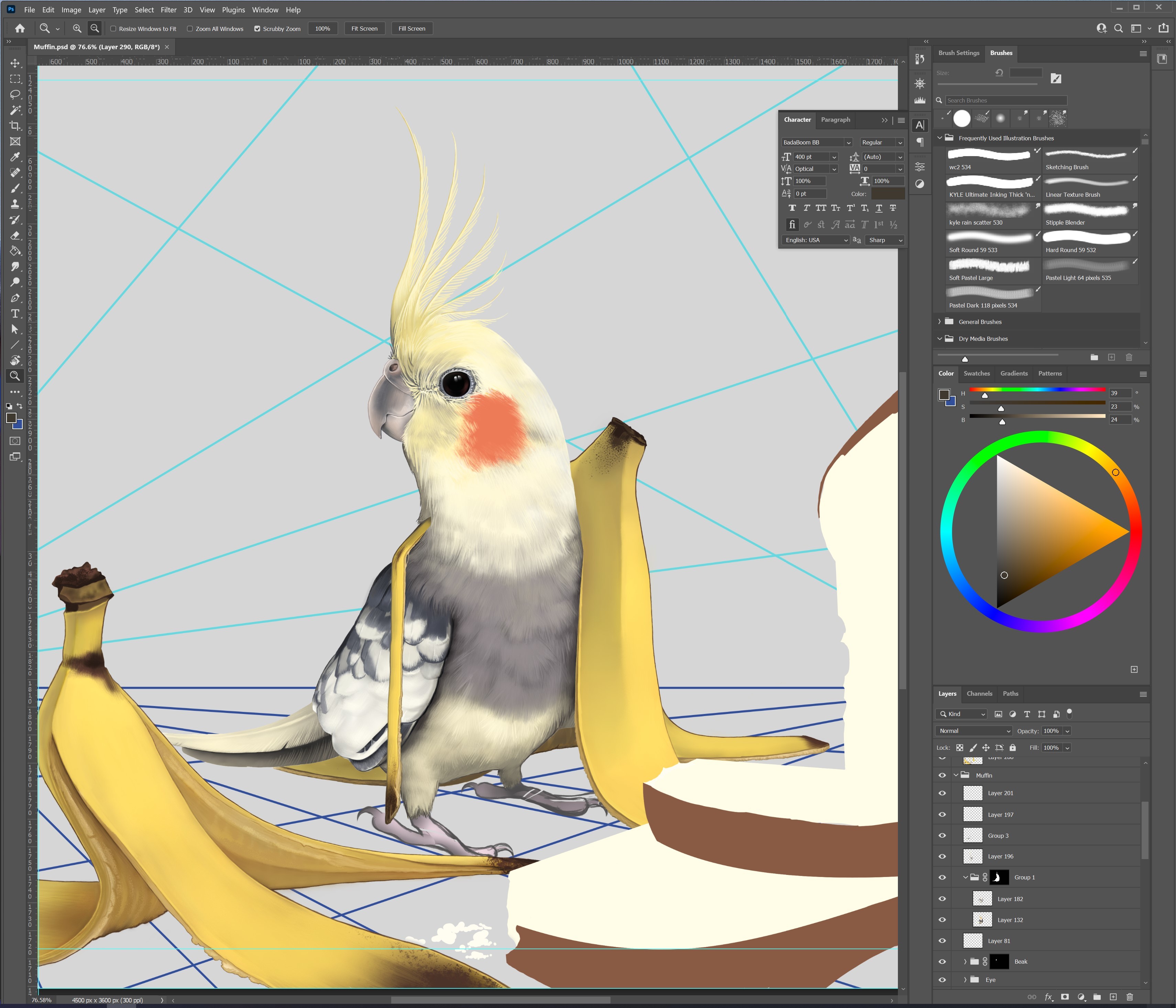
DONE!!! Yays!
I enjoyed working on this, Muffin is too cute!

I took some artistic license regarding the shadows and the bread perspective. In the real world this setup wouldn't cast blue shadows, lol, BUT I love it, because it pulls the top and bottom half of the image together. Also the bread would cast a much bigger shadow, BUT it wouldn't look good aesthetic wise.
Will be darkening the banana peel that is in shadow. The feet need need color tweaking as well.
I LOVE to work at this time. NOBODY bothers me, lol.
Had to fix some minor perspective issues with the feet, banana, tail, and bread.
Still have to layer the feathers over the banana on his right side. Also finish the feet and bread. I can't wait to add the shadow! The shadows will help to pull the image further together.
Still planning on adding the "MUFFIN!!" text, lol. Not focused on that right now.

Photoshop Brushes and WIP
Mar. 27th, 2021 12:15 am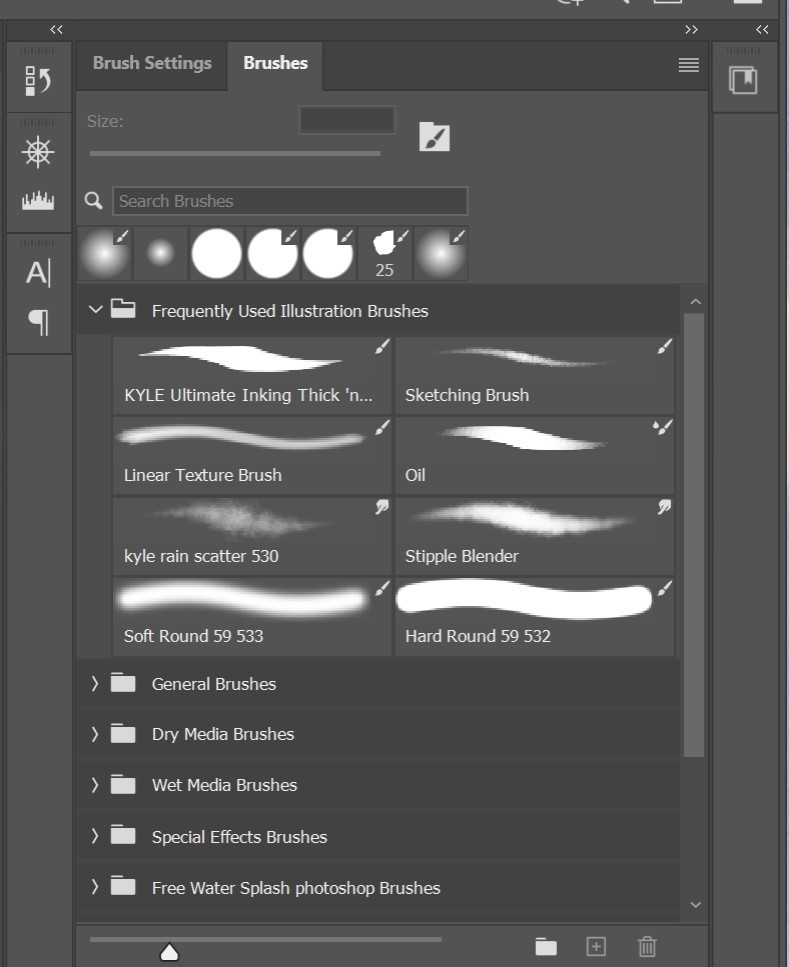

Dear lord. Finding the right brush/blender combination in Photoshop was a challenge. Once I found and tweaked the right brushes it made painting a lot easier. The trick is combining texture brushes with hard solid line brushes. The contrast between the two can be striking.
Put in some more details in the head and body. Still need add feather edges to the head and lighten up some of the shadow. Looking to finish the body this weekend and finish the bananas and bread next week.
Muffin WIP 1
Mar. 23rd, 2021 09:57 pm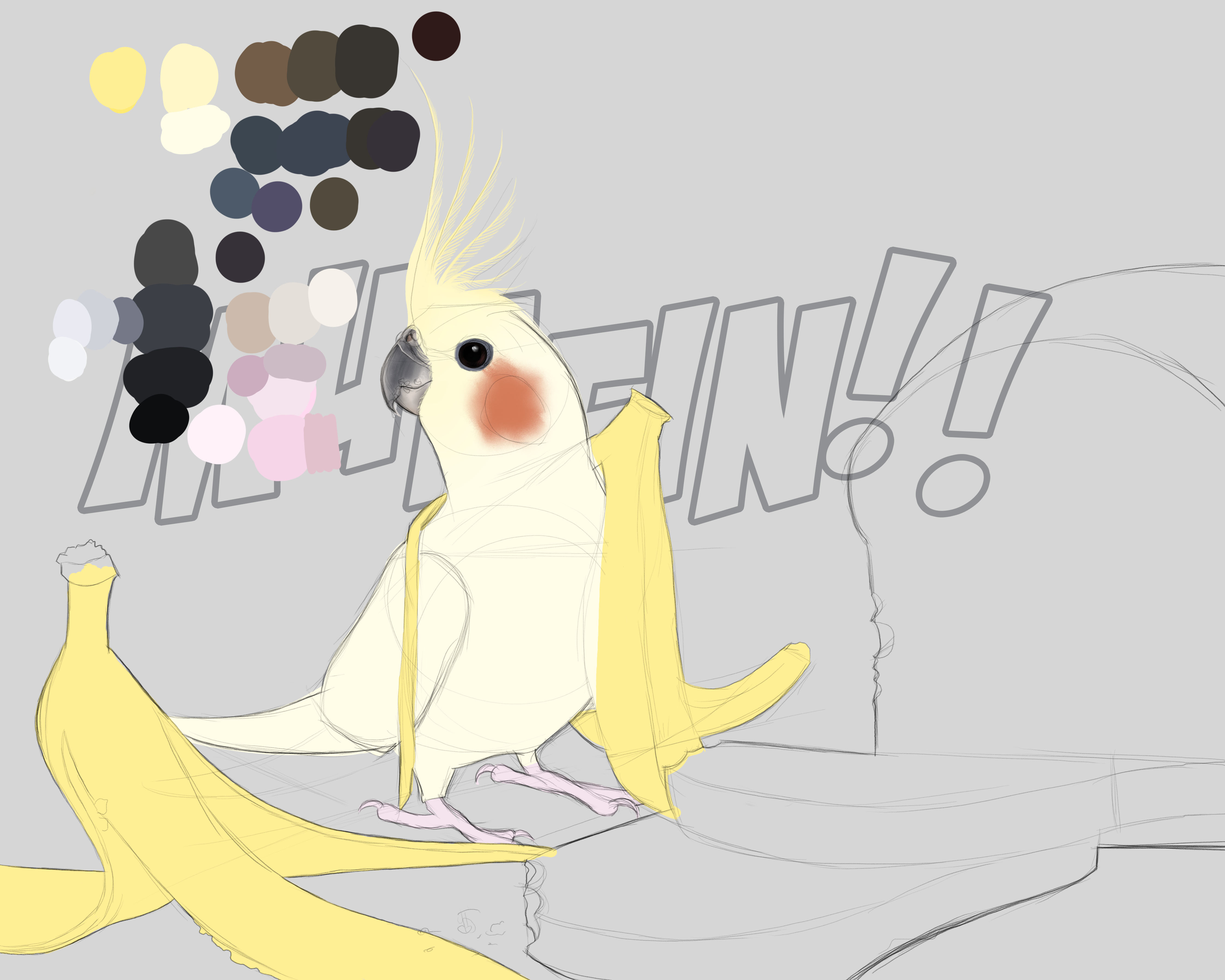
The majority of the colors are blocked in. Working my way from the beak and eyes to the feather/body. Thank god for layer masks. My sketch was a bit off and I needed to correct the beak area.
I'm going through serious Sketchbook withdrawal :'(

Photoshop vs CSP
Mar. 16th, 2021 10:57 pm

In preparation of the art trade with
Going forward I have decided to retire Sketchbook for any serious art pieces. The lack of powerful features and it's color management killed it for me.
Back to Ps--damn. This version plus the new brushes have me rethinking using Ps...
LOL
As you can see both programs can render really light and dark marks very well. Both are feature rich programs. Both are equally responsive. So which do I choose?
I still give the slight edge to CSP for mark making and illustration related UI features that Photoshop doesn't have. BUT Photoshop is a lot more familiar to me and I use it for graphic design. CSP is probably the better choice, but I will probably will go with Photoshop for this project, I just don't have the time to fully learn, what I need to learn with CSP. HOWEVER, I will continue playing with CSP and all it's wonderful features until I learn.


ALMOST DONE!!!!
That swiggly mess, I promise it'll be something, lol. The purpose is to hide the toucan's missing foot, lol. Yeah, I'm too lazy to make it.
Originally I wanted flowers, but that shit is too time consuming, so this thing will have to do.
Finally Laying Color with CSP
Feb. 27th, 2021 03:30 pm
QUICK Laying color with CSP. All I can say is wow. It has taken me a quarter of the time compared to Sketchbook to get to the point where I can start to refine it (and fix problem areas, like the lopsided head, lol). The blue highlights on the cheek didn't come out the way I wanted it to, it's ok I'm still experimenting with the brushes and different blenders.

This is taking forever. I'm currently working on the Channel Billed Toucan. Fixing it's wing. Maybe I should have did it in CSP? LOL

Oh it's only taking me gazillion years to get this done. I did the Channel-Bill Toucan at the Airbnb.
When I started I had all the colors on one layer. I had good intentions, but then I got lazy and the color palette is now on other layers, lol. The feathers are going to be a real jerk.
